I have an Android, a Galaxy S3 and wanted to decrease the size of the displayed font. One of the ways to do so is to go to settings and select an option that allows the user to change the font size via the volume controls. I've wondered more than once whether this was overloading the UI - especially as there was no indication on the screen that the volume was the font-size controller. (And of course a link from this indicator to the settings control.)
Low and behold I overheard someone on the subway speaking to a friend that the font-size on his messages had zoomed too large and he didn't know why that happened or how to change it back to the default settings. I was able to change it for him. Somehow he had gone to settings and selected this without knowing. To add more pain to the situation the menu associated with messages does not provide the user with a means of changing font-size.
The lessons to be learned? When overloading UI controls give an indication to the user what is being done and link back to the admin section to allow the user to change the settings. And second provide multiple ways to change the settings. It can be as simple as a "more" link.
Showing posts with label Usability. Show all posts
Showing posts with label Usability. Show all posts
Sunday, January 19, 2014

Friday, November 15, 2013
UX Design: Outline versus Solid Shapes
I read an interesting article regarding that the brain takes more time to process an outline than a "filled-in" icon.
Combining the two questions would be: are there user personas which are negatively impacted to the point (from the reduced scannability) that they will either not be able to use the app or would reject it? IF that happens then absolutely one must "sacrifice" the hollow icons and follow the author's advice: "Design above it."
Your brain traces the shapes on the first row an average of twice as much. Your eye scans the outside shape and then scans the inner line to determine if there is value in the “hollow” section.While I agree with this completely within the context of the article - designing mobile apps - where people are often scanning your app while moving, or being in a crowded environment where they will devote even less of their attention then they do while sitting at their desk, I fear that Aubrey Johnson may be taking the point a little too far. He writes:
Icons without this empty core are processed as definite and only the outer lines are processed. Depending on the outline of the shape, this happens pretty fast. No matter the shape, though, the hollow icons take more time to process.
Choosing to use hollow icons for the sake of lightness / very-modern aesthetic is not the issue, it’s that to sacrifice the usefulness of what an icon does (aide in reading speed) for aesthetic feeling is really bad. Don’t follow bad design decisions to appease a platform.Yes people will scan the solid shape faster than the outline, and if they are hurried and distracted will more likely miss or have to concentrate more on the app to perceive the icon, but this ought not be taken as a hard and fast reason to not use outlined icons - even in mobile apps. At issue: (from an IA perspective) is "how are people using the apps?" and from a UX perspective it would be: "does the [less readable] iconography increase the users enjoyment/experience more than the lack of usability detract from the experience?"
Design above it.
Combining the two questions would be: are there user personas which are negatively impacted to the point (from the reduced scannability) that they will either not be able to use the app or would reject it? IF that happens then absolutely one must "sacrifice" the hollow icons and follow the author's advice: "Design above it."
Tuesday, April 2, 2013
Design Fail
I needed to contact EZ-Pass regarding a question I had with their service. Typical with many government sites EZ-Pass is a horror but I couldn't resist posting this epic fail.

The Frequently Asked Questions pages may have the answer to your question. If you have not looked there already, please check there first. If the FAQs do not answer your question or issue, please submit your questions or comments using one of the links below. We're more than happy to respond! We welcome your inquiries and will get back to you in a timely manner.There are, unfortunately no links below aside for Account Holders. But what if you are not an account holder, or do not have your account information? The minimum width for the site is about 1024. This is right in keeping with up-to-date design principles and will be even more of a pleasure to use on mobile device or tablet than it is on a laptop.

Friday, March 22, 2013
Hero Shot and other interesting trends in Web Design*
There are several interesting design ideas that have taken hold.
The Hero Shot / One-Page Design / Flat-UI Design
The Hero Shot
A hero shot is a large image that dominates the viewing area. The image, for all practical purposes, is the design. It's a very clean, very engaging look. The image brings out the emotional response of the viewer and the simple navigation and call-to-action elements do not overwhelm the viewer. Present different images on reload and the site remains fresh for return users - and it also allows one to more easily integrate multi-variate testing into site design.
One Page Design
The hero shot works very well with one page design. There were many reason we, as designers, went away from one page design in the late 1990s. Multi-page designs were "kooler"; it allowed for more images and text to be quickly shown to the user (connection speeds were MUCH slower then); it allowed for knowing when and where the user dropped out; it was useful for breaking up server-side interaction; it was useful for showing more advertising; it allowed more methodical presentation of data; and it was kooler. Designers and marketers want something new, attractive.
As with all things fashion the one-page design is fresh once again. Of course there's some interesting twists: namely the transitions between "pages." For all practical purposes the one-page design is presenting differing "screens" with transitions between them, but the fact that they're all on one page makes it new. I would say that there is also a utility in the design as all the information is loaded and remains even if the server connection is lost. Ultimately its appeal is not its utility - it's its freshness. Regarding the reasons why designers went away from one-page design and their return. All the practical reasons that existed before no longer remain.
Flat-UI Design
The use of flat, as opposed to textured, or beveled elements. It's advantage is that it has a clean, fresh look. It allows more elements to be presented to the user but at the same time maintain a more minimalist feel. All three elements are part of the current design zeitgeist where mobile design is influencing design presented on larger screens.
* For my distinction between Web Design, UX Design and UI Design please see "What's in a Name? Web, UX, UI Design"
The Hero Shot / One-Page Design / Flat-UI Design
The Hero Shot
A hero shot is a large image that dominates the viewing area. The image, for all practical purposes, is the design. It's a very clean, very engaging look. The image brings out the emotional response of the viewer and the simple navigation and call-to-action elements do not overwhelm the viewer. Present different images on reload and the site remains fresh for return users - and it also allows one to more easily integrate multi-variate testing into site design.
One Page Design
The hero shot works very well with one page design. There were many reason we, as designers, went away from one page design in the late 1990s. Multi-page designs were "kooler"; it allowed for more images and text to be quickly shown to the user (connection speeds were MUCH slower then); it allowed for knowing when and where the user dropped out; it was useful for breaking up server-side interaction; it was useful for showing more advertising; it allowed more methodical presentation of data; and it was kooler. Designers and marketers want something new, attractive.
As with all things fashion the one-page design is fresh once again. Of course there's some interesting twists: namely the transitions between "pages." For all practical purposes the one-page design is presenting differing "screens" with transitions between them, but the fact that they're all on one page makes it new. I would say that there is also a utility in the design as all the information is loaded and remains even if the server connection is lost. Ultimately its appeal is not its utility - it's its freshness. Regarding the reasons why designers went away from one-page design and their return. All the practical reasons that existed before no longer remain.
Flat-UI Design
The use of flat, as opposed to textured, or beveled elements. It's advantage is that it has a clean, fresh look. It allows more elements to be presented to the user but at the same time maintain a more minimalist feel. All three elements are part of the current design zeitgeist where mobile design is influencing design presented on larger screens.
* For my distinction between Web Design, UX Design and UI Design please see "What's in a Name? Web, UX, UI Design"
Sunday, July 29, 2012
What you hear is not what you get
This is interesting presentation showing that visual elements affect the sound you think you hear. If you have not seen this before, it's worth watching.
Sunday, June 10, 2012
Skype (changing default browser) and user admin design
I'm starting to use Skype more and more for work. When people send
me links in the IM the link automatically opens up in Internet Explorer.
I wanted to change the default to Chrome but could not find where to do
so.
I went on line and found the answer: Skype opens up the device's default browser. You cannot make the change within Skype. You must go to your browser of choice and make the change there.
This begs the question: when designing user admin sections should IA professionals include information on settings that their app doesn't update? In this case it would have been very nice for Skype to have a tab " Update Default Browser" and tell me, the user, that I would have to go to Chrome and declare that my default browser.
Now, you may ask - why didn't I do that already? Because I unpinned IE from the Windows 7 taskbar. It wasn't part of my consciousness - that's why. :-)
I went on line and found the answer: Skype opens up the device's default browser. You cannot make the change within Skype. You must go to your browser of choice and make the change there.
This begs the question: when designing user admin sections should IA professionals include information on settings that their app doesn't update? In this case it would have been very nice for Skype to have a tab " Update Default Browser" and tell me, the user, that I would have to go to Chrome and declare that my default browser.
Now, you may ask - why didn't I do that already? Because I unpinned IE from the Windows 7 taskbar. It wasn't part of my consciousness - that's why. :-)
Monday, March 12, 2012
IA and breadcrumbs
There is a terrific website to help your children learn math, The Khan Academy. They have excellent videos. I wish this resource was available when I was in high school and college. I mention this site, not because it is an excellent resource, but because they have failed, failed miserably in a basic way.
When one goes to a page to watch a video there is breadcrumb across the top.

There is even a nice feature where a drop-down appears and one can select other videos in the same sub-category.

However, should you decide to see a video in another category - you cannot select a higher-level category. You are forced to go back, in a convoluted way, to the "index" page. Part of the problem is that some categories have a LOT of videos. Still, there are nunumerous workarounds to that problem.
There is one other issue. The Khan Academy is trying to increase participation by using gamification techniques. It's an excellent idea, as you watch videos you get "points." It provides an incentive to join the community. That's excellent. However, should you decide to join, you must login with either a Facebook or Google account. Tsk. tsk. Not everyone wants everything they do to be so easily and completely tracked by Facebook and/or Google.
All that being said, I still highly recommend this site.
When one goes to a page to watch a video there is breadcrumb across the top.

There is even a nice feature where a drop-down appears and one can select other videos in the same sub-category.

However, should you decide to see a video in another category - you cannot select a higher-level category. You are forced to go back, in a convoluted way, to the "index" page. Part of the problem is that some categories have a LOT of videos. Still, there are nunumerous workarounds to that problem.
There is one other issue. The Khan Academy is trying to increase participation by using gamification techniques. It's an excellent idea, as you watch videos you get "points." It provides an incentive to join the community. That's excellent. However, should you decide to join, you must login with either a Facebook or Google account. Tsk. tsk. Not everyone wants everything they do to be so easily and completely tracked by Facebook and/or Google.
All that being said, I still highly recommend this site.
Tuesday, December 27, 2011
What not to do in a Customer Survey
I've seen a lot of sites that belong on my "what not to do list" but this is one of the worst I've seen in a while. I tried to leave a comment on MetroPCS but was unable to without answering numerous other questions. MetroPCS requires customers to answer all 30 questions in order to submit a comment. I understand the desire to get customer feedback on a number of issues but this is ridiculous. So ridiculous that you have to wonder if they really want user feedback.


Friday, November 18, 2011
How do different age groups perceive web applications?
I’ve been wondering how different age groups perceive web applications. I am not finding what I’m looking for. Too many of the tests seem to focus upon how *today’s* elderly perceive the web. For example: “In most cases designers can use standard Web-related terms and assume that users understand them. But in this study, several users were unsure about Web terminology, such as page, homepage, website, or the Web.”
This is not a function of age – but a function of new users. It just happens to be that these new users are also elderly.
I’m looking for such information such as contrast, font size, font type, line-width, pop-ups, amount of content on a screen, decision making, etc…
Jakob Nielsen wrote the following back in 2002
OK. So we have the IA perspective on it - but how about the UX? We know reading comprehension is imperative. How about more tests on what *works* in a wider sense? What stimulates interest? What changes exist in how people scan and use websites as they age? I suppose we're going to have to wait for more tests. Maybe as eye-tracking software become more and more affordable we can have more information.
This is not a function of age – but a function of new users. It just happens to be that these new users are also elderly.
I’m looking for such information such as contrast, font size, font type, line-width, pop-ups, amount of content on a screen, decision making, etc…
Jakob Nielsen wrote the following back in 2002
Why Usability is Lower for Seniors
Websites tend to be produced by young designers, who often assume that all users have perfect vision and motor control, and know everything about the Web. These assumptions rarely hold, even when the users are not seniors. However, as indicated by our usability metrics, seniors are hurt more by usability problems than younger users. Among the obvious physical attributes often affected by the human aging process are eyesight, precision of movement, and memory.
Usability for Senior Citizens
OK. So we have the IA perspective on it - but how about the UX? We know reading comprehension is imperative. How about more tests on what *works* in a wider sense? What stimulates interest? What changes exist in how people scan and use websites as they age? I suppose we're going to have to wait for more tests. Maybe as eye-tracking software become more and more affordable we can have more information.
Tuesday, February 15, 2011
Two Important Principles in Designing for Mobile Devices
First, place less items on the screen. Only the most important content and features should be displayed. What’s normal for a 1024x768 + screen is overwhelming on a smaller screen resolution.
Second, use only one column. Eliminate what would otherwise be in the right column and place the navigation that might have been placed in the left column at the top and the bottom.
If you started designing websites in the 1990s this is a simple transition. For those who started designing after 1024 + screens became the norm … have fun. :-)
Second, use only one column. Eliminate what would otherwise be in the right column and place the navigation that might have been placed in the left column at the top and the bottom.
If you started designing websites in the 1990s this is a simple transition. For those who started designing after 1024 + screens became the norm … have fun. :-)
Friday, April 23, 2010
YouTube and Usability, Again
As a follow-up to an earlier post I read the following in Google User Groups:
Couldn't have said it better myself. Google has an amazing product line (YouTube) but every action it seems to take baffles me.
YouTube's "product team" is not about functionality.
In fact, their prime directive seems to be to remove as much function as possible, while making every remaining operation as non-intuitive, cumbersome, and fugly as possible.
Their complete destruction of the video watch page is the latest prime example.
Couldn't have said it better myself. Google has an amazing product line (YouTube) but every action it seems to take baffles me.
End Users in Action
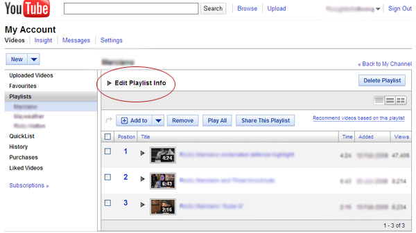
I was working with a client setting up a YouTube channel and had an interesting learning experience. The client wanted to change the name of one of his newly created playlists and was unable to do so.

He tried clicking on the list on the left, then right clicked on the name in that list[1]; clicked on the name of playlist [2]; then searched the buttons above the videos -- with the mouse moving back and forth [red box], left and right over the buttons; then clicked the drop-down arrow next to the ADD TO [3]; went to change screen icons on the right [4]; went back up to his Channel Name and chose the dropdown from there. [5] Came back this screen and gave up.

A co-worker spent at least 15 minutes looking around the Google YouTube help pages without able to find it. Both the client and the co-worker are experienced "expert" computer users. Both missed where they were supposed to go. Both assumed -- because of YouTubes low functionality -- that they would have to delete their playlist and create a new one.
Both couldn't believe it when I showed them the link.
How illuminating it is to watch users in action.
So, how does one edit the name of the playlist?

If you're on your "My Channel" screen (not on this screen) you have to:
1. Select the drop down by your channel name
2. Select Favorites
3. On the left column select "Playlists"
You are then at "this" screen.
4. Select the drop down by "Edit Playlist Info"
5. Edit the title (should be clear at this point)

He tried clicking on the list on the left, then right clicked on the name in that list[1]; clicked on the name of playlist [2]; then searched the buttons above the videos -- with the mouse moving back and forth [red box], left and right over the buttons; then clicked the drop-down arrow next to the ADD TO [3]; went to change screen icons on the right [4]; went back up to his Channel Name and chose the dropdown from there. [5] Came back this screen and gave up.

A co-worker spent at least 15 minutes looking around the Google YouTube help pages without able to find it. Both the client and the co-worker are experienced "expert" computer users. Both missed where they were supposed to go. Both assumed -- because of YouTubes low functionality -- that they would have to delete their playlist and create a new one.
Both couldn't believe it when I showed them the link.
How illuminating it is to watch users in action.
So, how does one edit the name of the playlist?
If you're on your "My Channel" screen (not on this screen) you have to:
1. Select the drop down by your channel name
2. Select Favorites
3. On the left column select "Playlists"
You are then at "this" screen.
4. Select the drop down by "Edit Playlist Info"
5. Edit the title (should be clear at this point)
Tuesday, April 20, 2010
Daniel Kahneman: On Remembered Happiness
Daniel Kahneman had a fascinating presentation at the TED 2010 conference on experiential vs remembered happiness. One of the illogical quirks of humans, according to Kahneman, is that we make future decisions based on how happy we remember an experience and not on how happy we actually were while experiencing the actual event. This is an interesting and useful conclusion for everyone in business who wants return customers.
Kahneman presents an interesting example contrasting the "experiencing" self versus the "remembering" self with patients who underwent colonoscopies. I would recommend seeing the presentation, but cutting the example to its core: people whose entire experience was painful and short would have a better "rememberance" if the experience was a little longer and the pain and discomfort at the end was bearable. This would hold true even if the technician doing the colonoscopy would "continue" with the proceedure simply for show for a few momements.
How does this apply to customer experience, to your role as a business person or IA? Pay attention to your customers remembered happiness as well as the experiential.
Speakers from TED 2010
Monday, April 19, 2010
Linking: How clearly differentiated do they need to be?
Have we finally passed the Jakob Nielsen threshold when it comes to linking? We now see sites, such as CNN, designed for the most basic of users presenting numerous different navigation models.

For example today’s edition of CNN uses several different models, few of them explicit. The top navigation assumes users know that they are links. The graphics link to the story, as do the titles below them. It is assumed that the user knows to click on them. Underneath the titles is a description of the article followed by the words FULL STORY. Although FULL STORY has a slightly different color the link differentiation is remarkably subdued. Below the lead articles are a list of articles under the label "Latest News." As with FULL STORY the visual differentiation is limited to a slight color variation.
My only quibble with the usability aspects of this page is that the description text should also link to the article.
Nonetheless we are crossing a major threshold here. Average users are expected to assume that links exist without any visual clues. Will there still be users who go to this site and be confused as what to do next? Yes but people who are confused will soon be crossing into Crocodile Dundee territory. After all EVERYONE knows what escalators and elevators do.

For example today’s edition of CNN uses several different models, few of them explicit. The top navigation assumes users know that they are links. The graphics link to the story, as do the titles below them. It is assumed that the user knows to click on them. Underneath the titles is a description of the article followed by the words FULL STORY. Although FULL STORY has a slightly different color the link differentiation is remarkably subdued. Below the lead articles are a list of articles under the label "Latest News." As with FULL STORY the visual differentiation is limited to a slight color variation.
My only quibble with the usability aspects of this page is that the description text should also link to the article.
Nonetheless we are crossing a major threshold here. Average users are expected to assume that links exist without any visual clues. Will there still be users who go to this site and be confused as what to do next? Yes but people who are confused will soon be crossing into Crocodile Dundee territory. After all EVERYONE knows what escalators and elevators do.
Saturday, April 17, 2010
Print Friendly URLs
Pages with a "print friendly" version usually deliver the same content but with a slightly different URL such as &print=yes. The print friendly version should be blocked from being indexed as users should not arrive at a "print friendly" page directly from the SERP. The most important reason is that the page does not provide the same navigational clues and outlets as do normal pages; secondly the print-friendly pages formatting does not lend itself to be the first glimpse users have of your site.
Saturday, April 3, 2010
Scrolling verus Clicking, Again
Not too long ago I wrote that we should get away from scrolling and go back to the codex. Jakob Nielsen in Scrolling and Attention: Alert Box, March 22, 2010 wrote:
Initially I was a little surprised by what Jakob Nielsen wrote as it differed markedly from what I've surmissed UNTIL I noticed that we were referring to two very different activities. He does use the term "article" but his examples refer to stores showing products versus a reader and an article. There is a considerable difference between reading an article and the quick scrolling through data that one does when going through a store's displays or a search engine's results page.
Today, users will scroll. However, you shouldn't ignore the fold and create endless pages for two reasons:
Long pages continue to be problematic because of users' limited attention span. People prefer sites that get to the point and let them get things done quickly. Besides the basic reluctance to read more words, scrolling is extra work.
The real estate above the fold is more valuable than stuff below the fold for attracting and keeping users' attention.
So, yes, you can put information below the fold rather than limit yourself to bite-sized pages.
In fact, if you have a long article, it's better to present it as one scrolling canvas than to split it across multiple pageviews. Scrolling beats paging because it's easier for users to simply keep going down the page than it is to decide whether or not to click through for the next page of a fragmented article. (Saying that scrolling is easier obviously assumes a design that follows the guidelines for scrollbars and such.)
Initially I was a little surprised by what Jakob Nielsen wrote as it differed markedly from what I've surmissed UNTIL I noticed that we were referring to two very different activities. He does use the term "article" but his examples refer to stores showing products versus a reader and an article. There is a considerable difference between reading an article and the quick scrolling through data that one does when going through a store's displays or a search engine's results page.
Friday, April 2, 2010
Usability, and General Best Uses
We generally don't think about usability issues when it comes to the 3rd Party systems. I found out that a client of mine, who uses a web-based email systems (because they're not tied down to one computer) had not been saving her "Sent" emails.
It got me to thinking about default values and prompting users to act in "their own best interests."
It got me to thinking about default values and prompting users to act in "their own best interests."
In case you have the same issues click on the 'Options' or 'Tools' link, usually located at the top right. (Yahoo and numerous other WebMail products.)
Wednesday, March 31, 2010
YouTube and Usability
There are many UX issues with YouTube. I've mentioned them before.
Here is a quote from a Google Employee responding to the frustration of YouTube users.
This is 2010 and Google still does not employ UX professionals? Who would, who could, possibly think to have one link do two such completely different tasks. Just because you may like a video in the context of general browsing doesn't mean that you want to add it to your playlist.
As an example I may *like* a video of a friends baby but that doesn't mean I want to save it to a site dedicated to Information Architecture.
Here is a quote from a Google Employee responding to the frustration of YouTube users.
Here are a few ways your input has influenced the page's current design...
** YOU SAID:
The "Like" button (which initially not only rated videos, but also saved the video to your Favorites) was confusing. It didn't feel right to rate and add a video to favorites at the same time.
*** HOW YOUR INPUT INFLUENCED THE NEW DESIGN:
By redefining what “Liking” a video means and adding a “save to” button in the actions bar, rating a video ("Liking" it) and saving a video (Favoriting it or adding it to a playlist) are now totally separate actions. So when you want to rate something, use the “Like” button. When you want to Favorite something, use the “save to” button.
This is 2010 and Google still does not employ UX professionals? Who would, who could, possibly think to have one link do two such completely different tasks. Just because you may like a video in the context of general browsing doesn't mean that you want to add it to your playlist.
As an example I may *like* a video of a friends baby but that doesn't mean I want to save it to a site dedicated to Information Architecture.
Thursday, March 25, 2010
Scrolling versus clicking
Site design has gone away from page turning format of the codex and back to the concept of scrolling. Is this an advancement? Should information be presented screenful by screenful? The problem in reading large amounts of information, whether scrolling or page turning / clicking format is the ease by which the reader may remember or mark his progress through the text. The advantage of “pages” is that one doesn’t lose ones place on the page. Scrolling requires our eyes to readjust to a new configuration of text. This is counter to our usual mode of acquiring information. Back in 2001 I wrote, while writing on the same subject:
Well now that it is clear to everyone that “page turning” is preferable to scrolling, and we can present pages nearly instantaneous the question becomes how do we convince customers to incorporate this in their site redesign?
There is a price for converting a website and for most companies there isn't a ROI. Retrofiting a "scrolling" site into a "page-turning" site calls for more experienced developers and new IA design. As such changes will have to wait until the next major site redesign.
What can be done right now? Scale back on the displayed text. Eliminate as much text as possible EXCEPT in the posted articles.
The only reason for not “turning” pages is because presently response time is too slow. Only when the response time become nearly instantaneously (less than 1 sec) does turning the page make sense.
Well now that it is clear to everyone that “page turning” is preferable to scrolling, and we can present pages nearly instantaneous the question becomes how do we convince customers to incorporate this in their site redesign?
There is a price for converting a website and for most companies there isn't a ROI. Retrofiting a "scrolling" site into a "page-turning" site calls for more experienced developers and new IA design. As such changes will have to wait until the next major site redesign.
What can be done right now? Scale back on the displayed text. Eliminate as much text as possible EXCEPT in the posted articles.
Wednesday, March 17, 2010
Meshing the Developer with the Information Architect
Many IA professionals come primarily from the creative side as I originally did. Now I come from the technical side as well. Both sides bring strengths, both sides have problems. I’m working on an intranet sub-site which is primarily being used by accountants and bookkeepers. A simple IA problem arose. It's a bit lenghty to explain. The intranet has a standard three column layout. Navigation on the left; middle column has major headings (bookkeeper & accountant items)and then drill down information on the right.
Everything is being kept above the fold in either iframes or scrolling divs as appropriate. The problem to be fixed was this: as the user scrolled down in the right column there was no indication of which heading had been selected. We needed to find a way to keep the label at the top of the right column.
The developer in me said: no problem just put a scrolling div inside the iframe and the problem is solved. The date and info would stay put as the data was scrolled down. It was more than a little disappointing when I found that an "unsolvable" problem came up. There were now two vertical scroll bars next to each other. The “obvious” solution was to remove the scrolling from the iframe. Unfortunately the coding that allowed the div to scroll (overflow: auto) overwrote the iframe code which normally removed the scrollbar (scrolling=no).
So what to do? Obviously we can’t let this stop us. There were two solutions. One solution was to build another iframe with the header information in it and have one link change both iframes. This would be a very clunky solution. The other solution would be to create a div that would hide the iframe’ scroll bar; leaving only the div scroll bar visible to the end user. Think of this div as an object in Visio or a layer in Photoshop that you brought to the front hiding what’s behind it.
I dislike these kludges; you shouldn’t have to hide coding problems with “fake” divs. That’s the developer in me speaking. What is the problem in knowing technical solutions? Simple, sometimes knowing the technical aspect of a problem is a distraction. The IA’s role is to solve IA problems; not to solve the developer’s problems.
Does this mean that developers are handicapped when it comes to doing IA work? Not at all I find that some IAs, from a more creative background, have issues with the Creative Director. They have the same problem in the creative end as I have in the development end. Namely do your job and leave others to do theirs – until they ask for a suggestion.
Everything is being kept above the fold in either iframes or scrolling divs as appropriate. The problem to be fixed was this: as the user scrolled down in the right column there was no indication of which heading had been selected. We needed to find a way to keep the label at the top of the right column.
The developer in me said: no problem just put a scrolling div inside the iframe and the problem is solved. The date and info would stay put as the data was scrolled down. It was more than a little disappointing when I found that an "unsolvable" problem came up. There were now two vertical scroll bars next to each other. The “obvious” solution was to remove the scrolling from the iframe. Unfortunately the coding that allowed the div to scroll (overflow: auto) overwrote the iframe code which normally removed the scrollbar (scrolling=no).
So what to do? Obviously we can’t let this stop us. There were two solutions. One solution was to build another iframe with the header information in it and have one link change both iframes. This would be a very clunky solution. The other solution would be to create a div that would hide the iframe’ scroll bar; leaving only the div scroll bar visible to the end user. Think of this div as an object in Visio or a layer in Photoshop that you brought to the front hiding what’s behind it.
I dislike these kludges; you shouldn’t have to hide coding problems with “fake” divs. That’s the developer in me speaking. What is the problem in knowing technical solutions? Simple, sometimes knowing the technical aspect of a problem is a distraction. The IA’s role is to solve IA problems; not to solve the developer’s problems.
Does this mean that developers are handicapped when it comes to doing IA work? Not at all I find that some IAs, from a more creative background, have issues with the Creative Director. They have the same problem in the creative end as I have in the development end. Namely do your job and leave others to do theirs – until they ask for a suggestion.
Subscribe to:
Posts (Atom)
