Friday, April 23, 2010

YouTube and Usability, Again

As a follow-up to an earlier post I read the following in Google User Groups:

YouTube's "product team" is not about functionality.

In fact, their prime directive seems to be to remove as much function as possible, while making every remaining operation as non-intuitive, cumbersome, and fugly as possible.

Their complete destruction of the video watch page is the latest prime example.

Couldn't have said it better myself. Google has an amazing product line (YouTube) but every action it seems to take baffles me.

End Users in Action

I was working with a client setting up a YouTube channel and had an interesting learning experience. The client wanted to change the name of one of his newly created playlists and was unable to do so.


He tried clicking on the list on the left, then right clicked on the name in that list[1]; clicked on the name of playlist [2]; then searched the buttons above the videos -- with the mouse moving back and forth [red box], left and right over the buttons; then clicked the drop-down arrow next to the ADD TO [3]; went to change screen icons on the right [4]; went back up to his Channel Name and chose the dropdown from there. [5] Came back this screen and gave up.


A co-worker spent at least 15 minutes looking around the Google YouTube help pages without able to find it. Both the client and the co-worker are experienced "expert" computer users. Both missed where they were supposed to go. Both assumed -- because of YouTubes low functionality -- that they would have to delete their playlist and create a new one.

Both couldn't believe it when I showed them the link.

How illuminating it is to watch users in action.

So, how does one edit the name of the playlist?


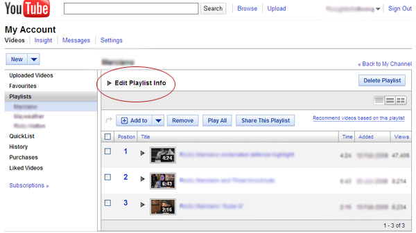
If you're on your "My Channel" screen (not on this screen) you have to:

1. Select the drop down by your channel name
2. Select Favorites
3. On the left column select "Playlists"

You are then at "this" screen.

4. Select the drop down by "Edit Playlist Info"
5. Edit the title (should be clear at this point)

Thursday, April 22, 2010

Digital Photocopies and Identity Theft

Just in case you haven't seen this article:

Digital Photocopiers Loaded With Secrets
Your Office Copy Machine Might Digitally Store Thousands of Documents That Get Passed on at Resale

Nearly every digital copier built since 2002 contains a hard drive - like the one on your personal computer - storing an image of every document copied, scanned, or emailed by the machine.

Tuesday, April 20, 2010

Daniel Kahneman: On Remembered Happiness


Daniel Kahneman had a fascinating presentation at the TED 2010 conference on experiential vs remembered happiness. One of the illogical quirks of humans, according to Kahneman, is that we make future decisions based on how happy we remember an experience and not on how happy we actually were while experiencing the actual event. This is an interesting and useful conclusion for everyone in business who wants return customers.

Kahneman presents an interesting example contrasting the "experiencing" self versus the "remembering" self with patients who underwent colonoscopies. I would recommend seeing the presentation, but cutting the example to its core: people whose entire experience was painful and short would have a better "rememberance" if the experience was a little longer and the pain and discomfort at the end was bearable. This would hold true even if the technician doing the colonoscopy would "continue" with the proceedure simply for show for a few momements.

How does this apply to customer experience, to your role as a business person or IA? Pay attention to your customers remembered happiness as well as the experiential.

Speakers from TED 2010

Monday, April 19, 2010

Linking: How clearly differentiated do they need to be?

Have we finally passed the Jakob Nielsen threshold when it comes to linking? We now see sites, such as CNN, designed for the most basic of users presenting numerous different navigation models.


For example today’s edition of CNN uses several different models, few of them explicit. The top navigation assumes users know that they are links. The graphics link to the story, as do the titles below them. It is assumed that the user knows to click on them. Underneath the titles is a description of the article followed by the words FULL STORY. Although FULL STORY has a slightly different color the link differentiation is remarkably subdued. Below the lead articles are a list of articles under the label "Latest News." As with FULL STORY the visual differentiation is limited to a slight color variation.

My only quibble with the usability aspects of this page is that the description text should also link to the article.

Nonetheless we are crossing a major threshold here. Average users are expected to assume that links exist without any visual clues. Will there still be users who go to this site and be confused as what to do next? Yes but people who are confused will soon be crossing into Crocodile Dundee territory. After all EVERYONE knows what escalators and elevators do.

Saturday, April 17, 2010

Print Friendly URLs

Pages with a "print friendly" version usually deliver the same content but with a slightly different URL such as &print=yes. The print friendly version should be blocked from being indexed as users should not arrive at a "print friendly" page directly from the SERP. The most important reason is that the page does not provide the same navigational clues and outlets as do normal pages; secondly the print-friendly pages formatting does not lend itself to be the first glimpse users have of your site.

Monday, April 12, 2010

Yelp - Trying to Fix a Problem that won't go away

Jeremy Stoppelma, the CEO of Yelp, wrote in Yelp's official blog that:

"User trust is the foundation on which Yelp is built and the reason 31 million consumers turned to the site last month to find a great local business. Today we're announcing two important product changes to reinforce that trust and make it even more clear that Yelp treats review content equally for all businesses, with no connection between advertising and reviews.

Specifically, we're adding the ability to see reviews filtered by our review filter and we're discontinuing the "Favorite Review" feature that's part of our advertising package."

Jeremy - what you need to do is to make certain that the reviews are from real people and are not placed there by companies; and to combat bad, spiteful reviews allow discussions on the comments (comments on the comments). This is not taking into account the "pay-for-play" perception where becoming a paid advertiser on Yelp enables you to remove bad comments and put up good ones.

Yelp is a good idea but falls short in execution.

Sunday, April 4, 2010

Apple may build a Search Engine

Data Apple collects about users from its vaunted iPhone is so valuable that the company must build a special search engine just to keep Google from gleaning insight from that data, analysts say.
Piper Jaffray analyst Gene Munster said there is a 70 percent chance Apple will roll out a mobile search engine tailored for its iPhone within the next five years.

Google is currently the default search engine on the iPhone, which has tens of millions of users. Pairing the leading search engine -- 65 percent in the U.S., more share abroad -- with one of the most popular smartphones on the planet made good business sense.
Apple-May-Build-a-Search-Engine

OK, now this may be an interesting fight. Google needs some serious competition, Microsoft doesn't seem to be bringing the fight to them; maybe Apple will be able to do so.

Credit Card App for iPad

As someone working on a day to day basis with other small and microbusinesses this app hits home. One can now use a credit card machine with an iPad. We're seeing the day when we can "touch" phones and be able to easily transfer information (either contact or payment). We were able to "beam" information between Palms a decade ago but this is one more step forward, easing the way for small and microbusinesses.

I've blasted this to all my business contacts. Wow!

Twitter Creator’s Credit Card Scanner Comes to iPad

This comes right on the heels of Silicon Valley's report that soon you will be able to snap a photos of a check with your cell phone and deposit it by transmitting an encrypted copy to your bank.

Regulators were surprised when the Sept. 11, 2001, terrorist attacks caused delays in financial transactions. With air traffic grounded for several days, the bundles of checks that banks and other businesses needed to move around couldn't get cleared.

So in 2003, Congress passed a law commonly known as Check 21. It allows anyone who receives a check to make a digital image of it rather than having to deliver it physically. The law has led many companies to install scanning machines that digitize thousands of checks at a time for deposit.

Deposit money by taking a photo

eCommerce, the times are a-changin'

Saturday, April 3, 2010

Scrolling verus Clicking, Again

Not too long ago I wrote that we should get away from scrolling and go back to the codex. Jakob Nielsen in Scrolling and Attention: Alert Box, March 22, 2010 wrote:

Today, users will scroll. However, you shouldn't ignore the fold and create endless pages for two reasons:

  • Long pages continue to be problematic because of users' limited attention span. People prefer sites that get to the point and let them get things done quickly. Besides the basic reluctance to read more words, scrolling is extra work.


  • The real estate above the fold is more valuable than stuff below the fold for attracting and keeping users' attention.


  • So, yes, you can put information below the fold rather than limit yourself to bite-sized pages.

    In fact, if you have a long article, it's better to present it as one scrolling canvas than to split it across multiple pageviews. Scrolling beats paging because it's easier for users to simply keep going down the page than it is to decide whether or not to click through for the next page of a fragmented article. (Saying that scrolling is easier obviously assumes a design that follows the guidelines for scrollbars and such.)

    Initially I was a little surprised by what Jakob Nielsen wrote as it differed markedly from what I've surmissed UNTIL I noticed that we were referring to two very different activities. He does use the term "article" but his examples refer to stores showing products versus a reader and an article. There is a considerable difference between reading an article and the quick scrolling through data that one does when going through a store's displays or a search engine's results page.

    Friday, April 2, 2010

    Usability, and General Best Uses

    We generally don't think about usability issues when it comes to the 3rd Party systems. I found out that a client of mine, who uses a web-based email systems (because they're not tied down to one computer) had not been saving her "Sent" emails.

    It got me to thinking about default values and prompting users to act in "their own best interests."

    In case you have the same issues click on the 'Options' or 'Tools' link, usually located at the top right. (Yahoo and numerous other WebMail products.)